
One of my first lessons in the coffee industry was this –
coffee is crowded.
Karen weckerly
To stand out on the shelf, the branding must be bold, relate to the customer, and reflect something about the company. When I started COROCO Coffee Roaster Collective™️ in 2019, the idea was to riff on the idea of existing rotating coffee subscription services, but controlled with one central hive-mind. COROCO was the brand parent that lead to developing several sub-brands. More on the COROCO brand story another time – today we delve into Diner!
Diner Inspiration
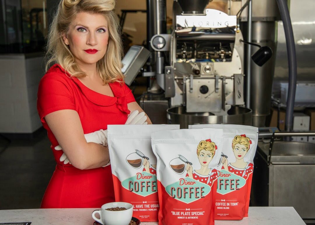
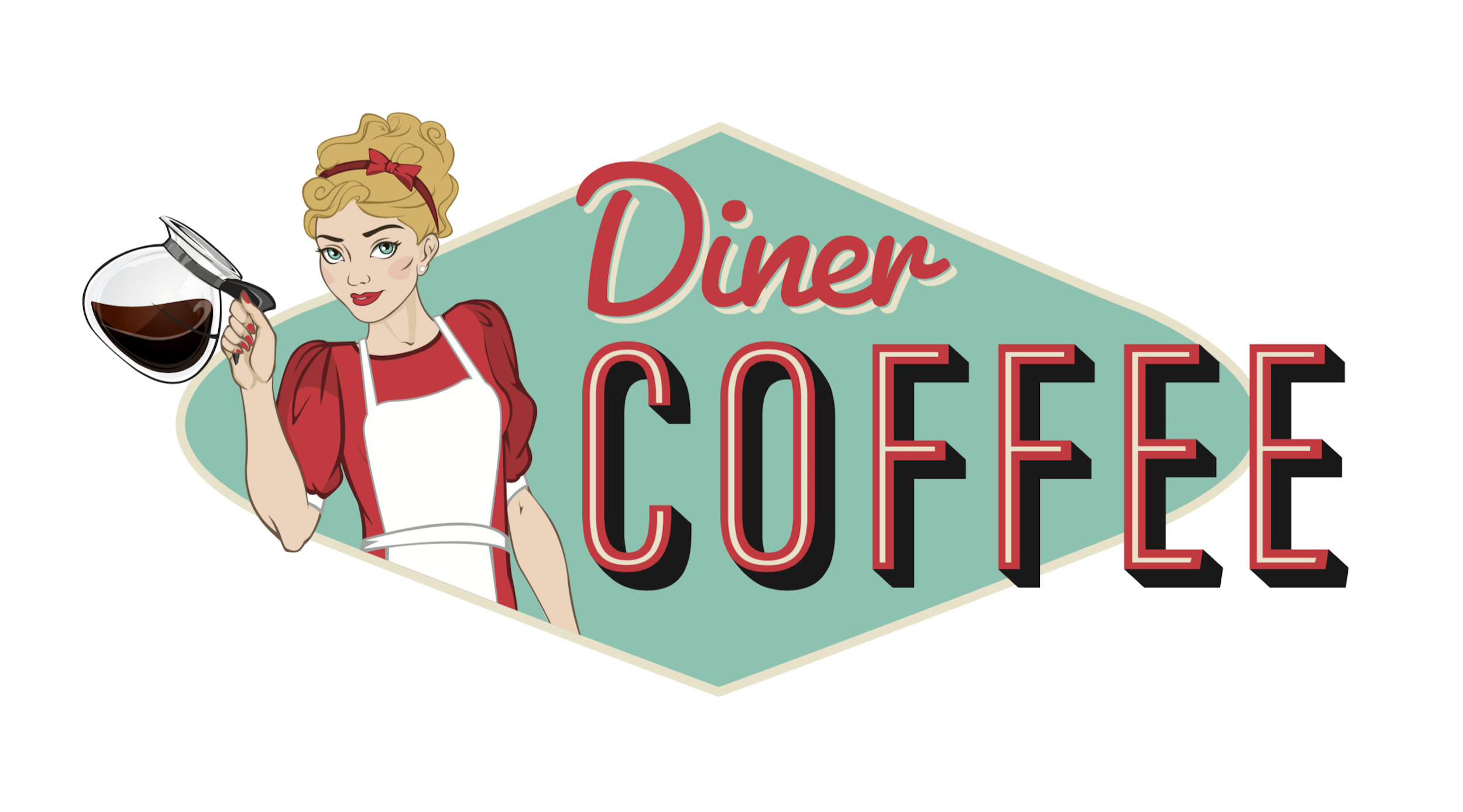
Diner Coffee™️ was one of the strongest of these sub-brands, so let’s walk through the process to get that iconic Diner-Girl bag. I started with a clear vision. The coffee in this packaging would be specialty, but taste like coffee. So many customers are looking for “coffee that just tastes like coffee.” Being approachable and specialty felt like a niche I wanted for my coffee company. The colors for this brand in my mind were always red, teal, black and white. As I pulled inspiration for the team of branding graphic designers, I made sure to stick to that palette. I felt that I could get in this brand’s shoes, so to speak, due to my part-time job waitressing as a student. I can still hear the older waitress at my restaurant, Shirley, asking her morning regulars, “the usual”? and filling up their coffee cups without anything else being said. Diner Coffee™️ is from the place in your imagination (or reality) where that server knows your name, your order, and the total of the ticket. She also has a snappy comeback for anyone giving her a hard time.
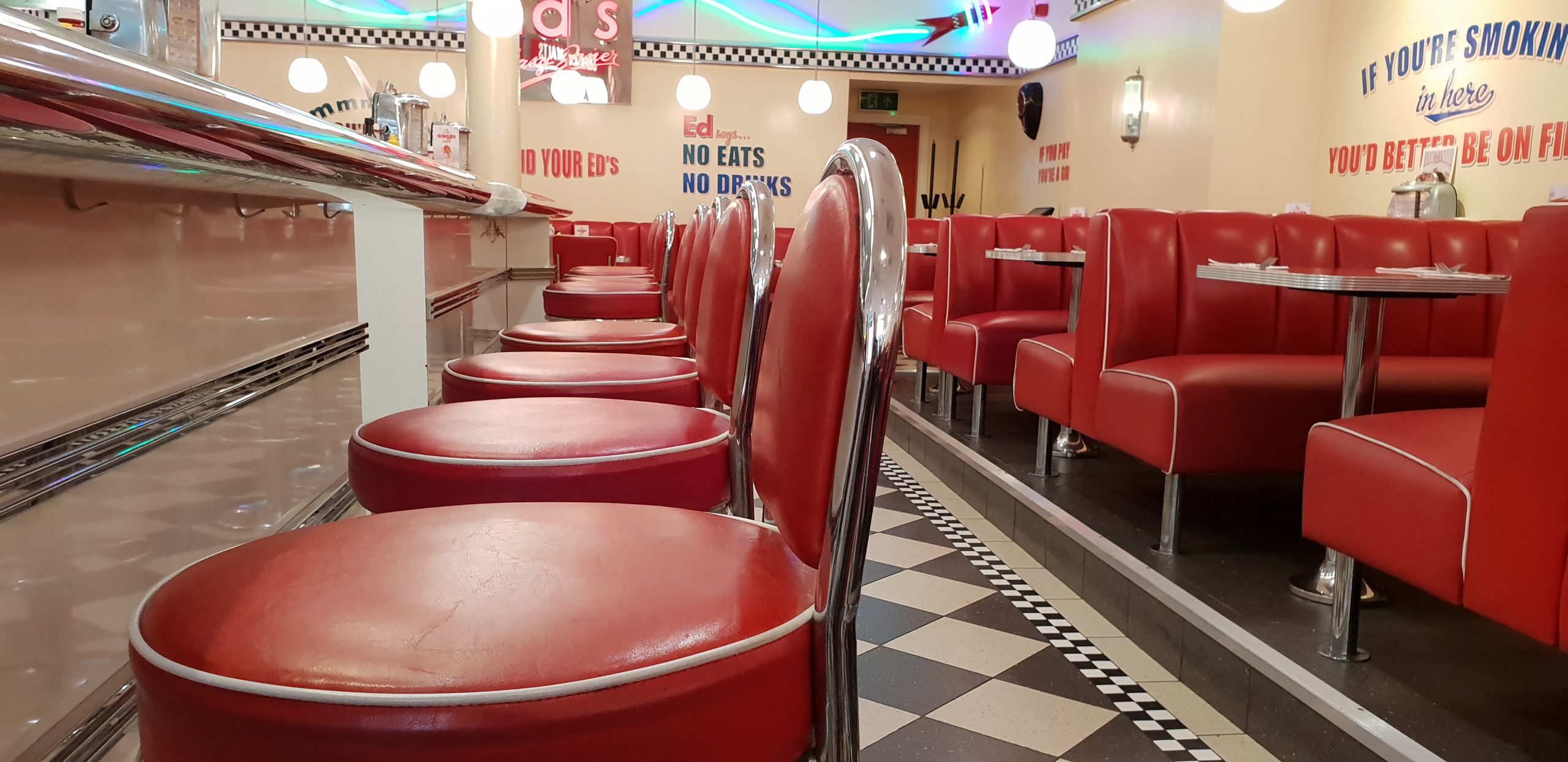
Route 66, vintage cars, good old fashioned customer service, bold colors, and a working woman with just enough attitude. Subtext: comfort food, inclusion in specialty coffee, affordable luxury, hipster-friendly yet unpretentious.
Diner Issues
Getting this brand off the ground had its challenges. Wholesome vs. Pulp Fiction vibes competing, overused Rosie the Riveter imagery feeling tired, vintage/modern balance, originality in a sea of other very cool rockabilly popular styles, how much of myself to reflect in the brand.
Here are some of the better Diner Coffee™️ hits and misses, from left to right: too old fashioned, possible yes-give the facial expression more spunk, too comic book heroine.
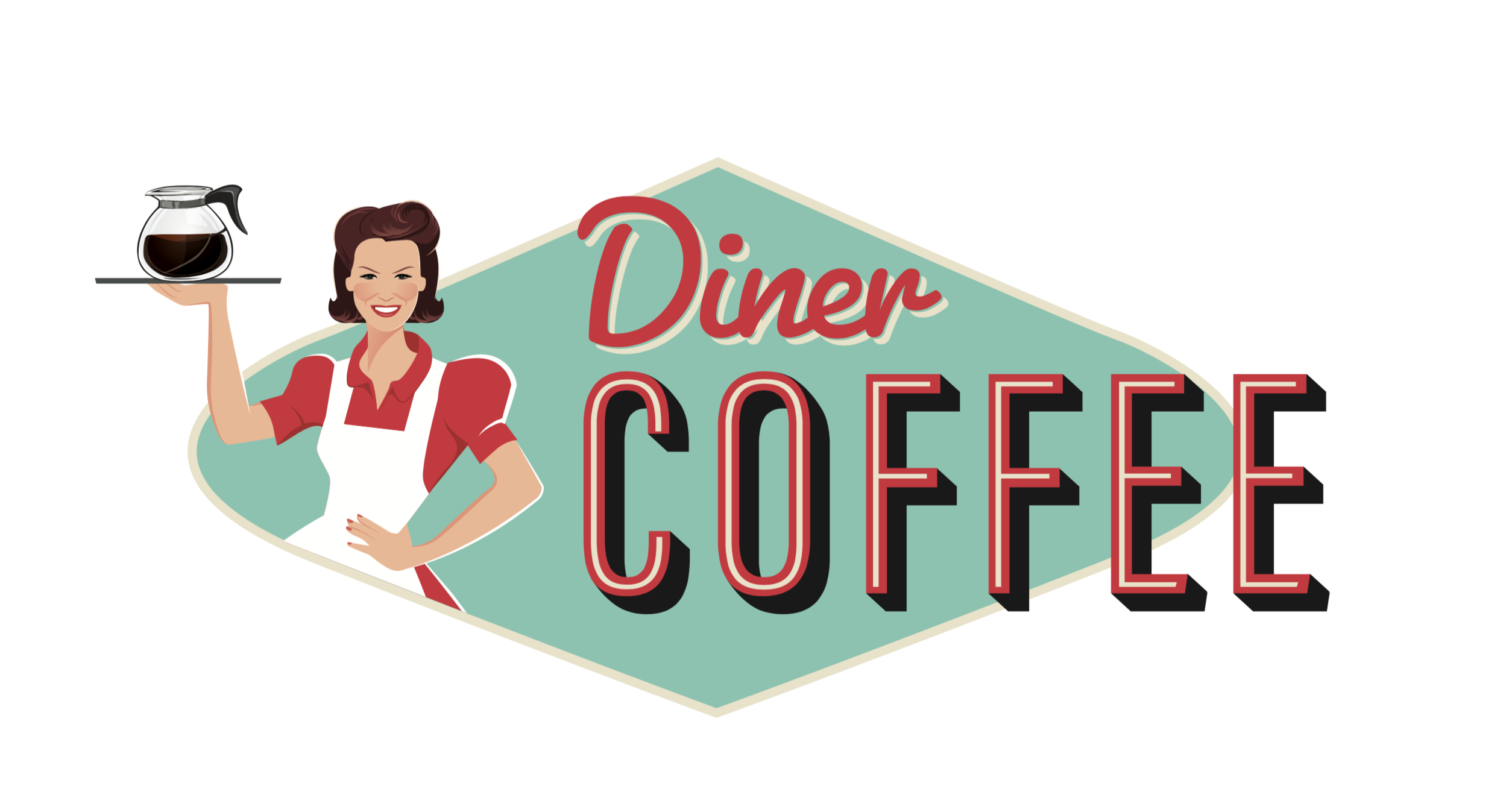
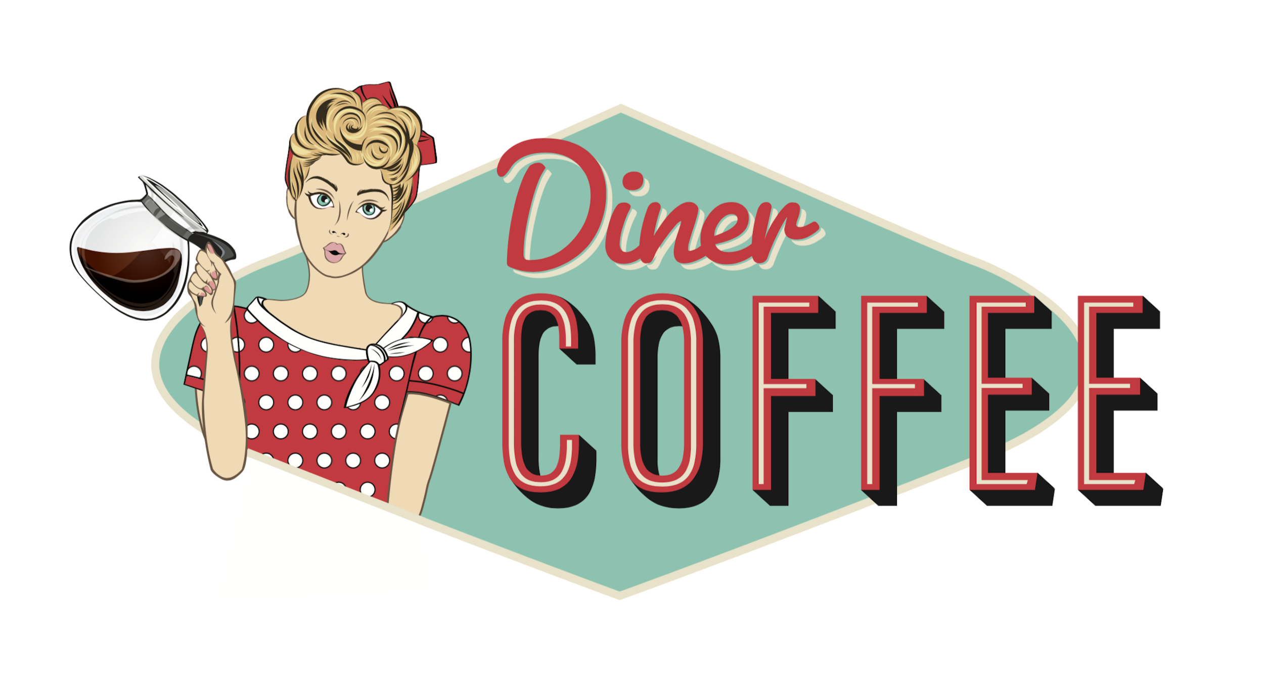
Your design team should not simply slap some text across a stock image. The design should speak to the target audience, be original, and match the customer’s product expectation. Revisions are your friend, over-designing is not. In the end, I decided to put myself out there, quite literally, on the bag, in cartoon form at least! It felt risky at the time, but in retrospect, it was the right call. Our bag manufacturer keeps a “Top Five” coffee bag design wall in their factory, and our design made the cut out of hundreds of bags!
Here is an idea of what to look for in a branding moodboard:
The final result. What do you think? Would you notice this brand in a crowded store and buy it?
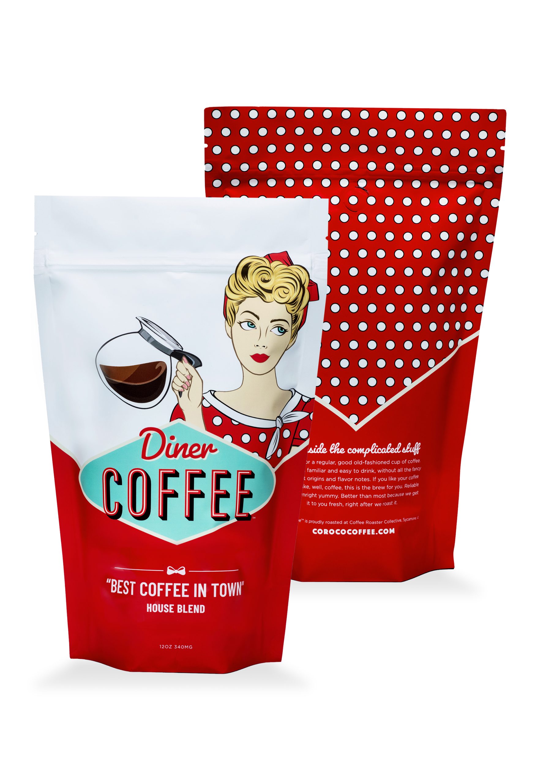
Diner Coffee™️ is available exclusively at CorocoCoffee.com or in-store at the roastery at COROCO Coffee Roaster Collective in Sycamore, IL.

